Blog
Album Of The Day: Love Press Ex-Curio by Charlie Peacock
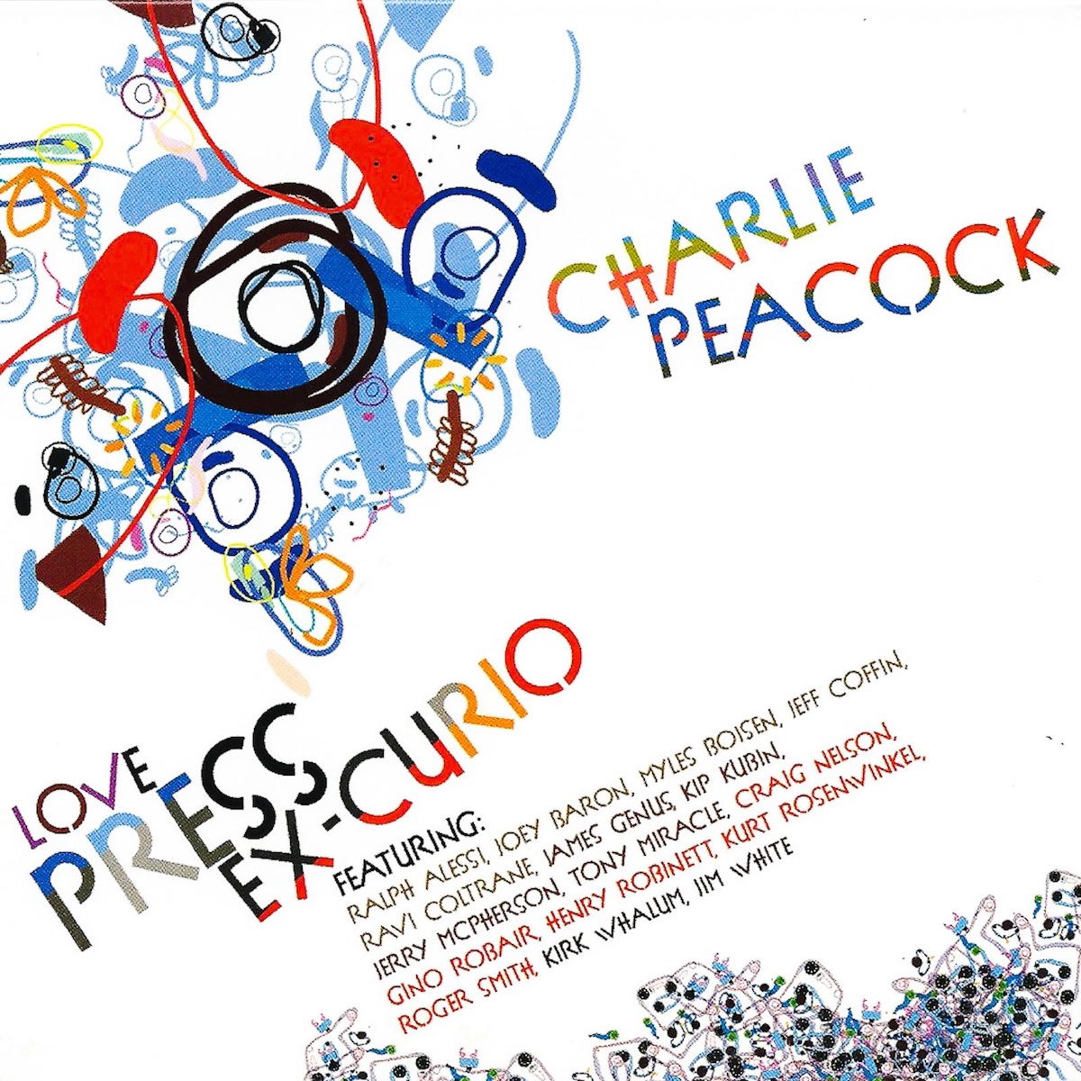
Released 20 years ago tomorrow, this is Charlie Peacock's first release as a jazz/improvisational music artist. For nearly 30 years before this, he had been playing in bands and performing his own brand of jazz-tinged and funk-infused pop, but on this album he records himself doing jazz on the keyboards and some electronic programming along with many of his musical friends and experienced jazz players. The title Love Press Ex-Curio is short for "Loves Pressure Exhibits Curiosity," probably a phrase that describes Charlie well. This is an album of experimental jazz with some electronic music and may not be for everybody, but I like the beauty and unpredictability of these compositions and improvisations. In the last few years, Mr. Peacock has released a good number of jazz and other types of instrumental albums on streaming, and sadly none of them are yet on physical formats like this one because some are quite good.
Release Year: 2005
Listen on Apple Music
Listen on Spotify
Album Of The Day: The Collection by Sara Groves
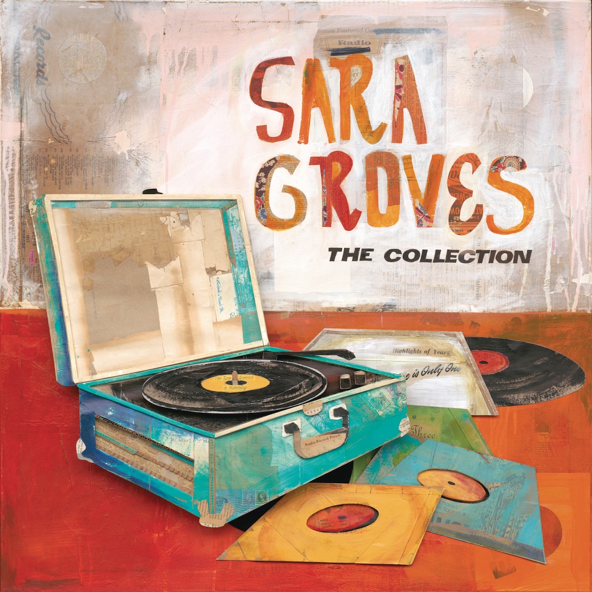
Released 12 years ago yesterday, this is the best of Sara Groves, one of Christian music's best singer-songwriters and the only artist that I know of who lives only two miles away from my house. (I was a fan before I knew she lived in the area, though.) Sara Groves writes piano-based pop with a jazzy bent, and definitely has a God-given gift for melody and rhyme. She sings beautifully and honestly about the struggles of life and also God's love, grace, relationships with friends and family, and much more. If you've never heard her music, I highly recommend you listen to this, as it collects some of her best songs from the first 15 years of her music career. It's a two-disc compilation of songs from her first 9 studio albums and though it does not have my favorite song of hers, "Loving A Person," it is still a great collection. If you like this, start listening to her albums after that and find even more great songs from Sara.
Release Year: 2013
Listen on Apple Music
Listen on Spotify
Album Of The Day: Highway 61 Revisited by Bob Dylan
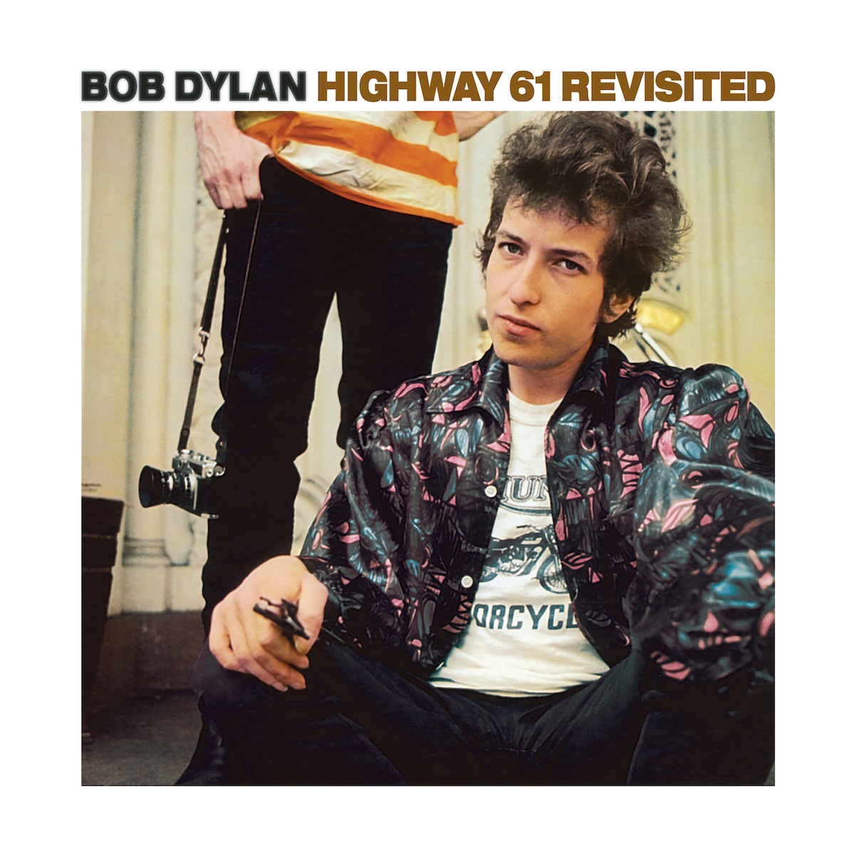
"Because something is happening here but you don't know what it is." Released 60 years ago last month, this is the album that cemented Bob Dylan as a force in rock 'n' roll. His first albums were covers of American folk standards, but more and more he started writing his own new folk songs and started having a full band back him on his recordings. In July of 1965, he played 3 songs including the new single "Like A Rolling Stone" with his rock band and an electric guitar at the Newport Folk Festival, where the audience was very divided about this new type of music from one of the young men who brought folk music back to the charts. A month later, this album was released and it's been one of the most iconic albums of rock music ever since. Dylan's songs keep the pace moving fast and the lyrics as poetic and hard-to-comprehend as ever. Bob Dylan also pushed the boundaries of what was allowed in music at the time, with a 6-minute lead single and an 11-minute closing track on Side B. This album is an important moment in music history and it's still lots of fun to listen to all these years later.
Release Year: 1965
Listen on Apple Music
Listen on Spotify
Album Of The Day: Raising Up The Dead by Caedmon's Call
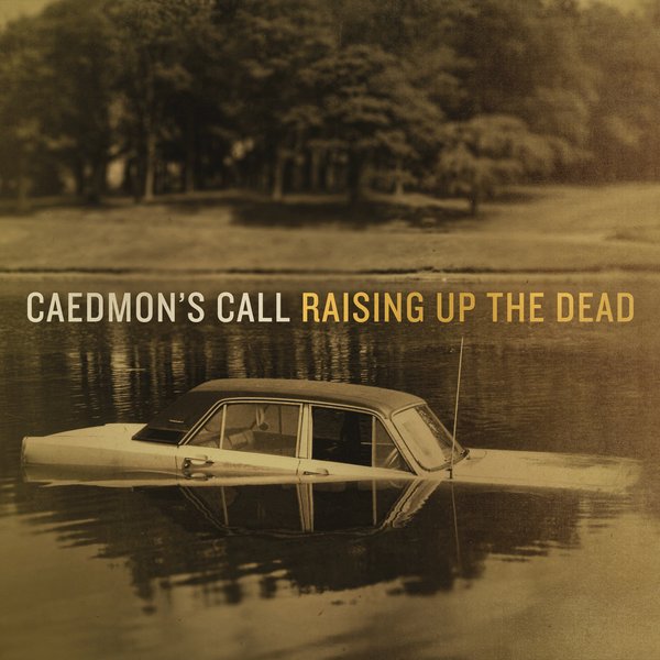
Caedmon's Call was a folk-rock band that started playing college campuses in Texas in the mid-'90s, and were one of the biggest bands in Christian music by 2000. Released 15 years ago yesterday digitally for their fans via their site and later released on CD and for wider digital consumption, this is the tenth and last studio album of new songs from Caedmon's Call. It's not their best album, but it's one you may have missed if you weren't looking for it. Musically, the band is on point and sounds great. However, much of their success in their early days was songwriting from people no longer in the band by this time. Derek Webb is here talking about life, but those that provided more theologically-based writing are not. Some of the band members who had not written much before got a chance to write and it's interesting to hear them writing along with Derek and other friends of the band. These songs never caught my ear and got stuck there, but I'm not sure if that's because it's not notable or if I just haven't listened to this much. If you like some good acoustic folk-rock sounds, though, I think it's worth a listen.
Release Year: 2010
Listen on Apple Music
Listen on Spotify
Album Of The Day: Hymns: Take The World, But Give Me Jesus by Ascend The Hill

Recently, instead of listening to a lot of modern worship anthems sung by the biggest American mega-churches, I've been listening to a few different bands do pop/rock settings of old hymn texts to new music. These texts were written, in some cases, hundreds of years ago and have been sung by many thousands or millions of Christians and are deeply rooted in the Bible. Released on this day 15 years ago, indie rock band Ascend The Hill brings lots of energy, guitars, drums and bass to some old hymns, writing new melodies to some and adapting the old melodies to the band's sound for others. I've only first heard this album a few days ago, but I like it a lot already and am listening again today on it's anniversary. The lyrics are timeless but also definitely still apply today, and the band balances well the rock sound with the reverence and worship of these songs. You might recognize some of the songs like "Be Thou My Vision", "I Surrender All" or "How Great Thou Art", but you will also hear some new ones. And even if you have sung those hymns before, you have never heard them done quite like this.
Release Year: 2010
Listen on Apple Music
Listen on Spotify
Album Of The Day: Nothing Is Sound by Switchfoot
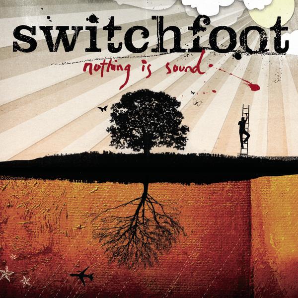
"The shadow proves the sunshine." In 2003, Switchfoot's career went into overdrive as their album The Beautiful Letdown found them playing to bigger audiences and selling way more albums than before. Many expected them to follow up this album with another set of positive rock anthems, but Switchfoot was not interested in delivering that. Released on this day 20 years ago, this still delivered on the rock album, but it was darker and more brooding than any Switchfoot album before. Songs like "Nothing Is Sound", "The Blues" and "The Fatal Wound" find the band lyrically struggling with the day to day of life and their purpose. But they also find hope in their fellow man and a higher power in songs like "We Are One Tonight", "Stars" and "Daisy". I also love their calling out some of the world's problems in tracks such as "Lonely Nation" and "Politicians". This album is definitely not what I expected when this was released, but it's a favorite of many Switchfoot fans and has become more beloved to me over time.
Release Year: 2005
Listen on Apple Music
Listen on Spotify
Album Of The Day: Takk... by Sigur Rós

Released on this day 20 years ago is the fourth album from Icelandic post-rock band Sigur Rós. If you have never listened to this band, I highly recommend giving this album a listen. The music may be a bit odd at first because it doesn't fit what we might expect music to sound like, but it also has an immense beauty to it. The album is primarily instrumental, and Jónsi's falsetto vocals of Icelandic or nonsense (I can't tell the difference, for sure) fit really well with the instrumentals. Sometimes it's moments of energetic rock, sometimes just a beautiful, peaceful instrumental that you might find on a classical album. They incorporate so many different sounds into this album and it's a great hour of music. This is music I often listen to in the background while reading a book since I listen to this album so often, but it also works great as the focus of your listening as well.
Release Year: 2005
Listen on Apple Music
Listen on Spotify
Buy on Bandcamp
Album Of The Day: Land by Tree63
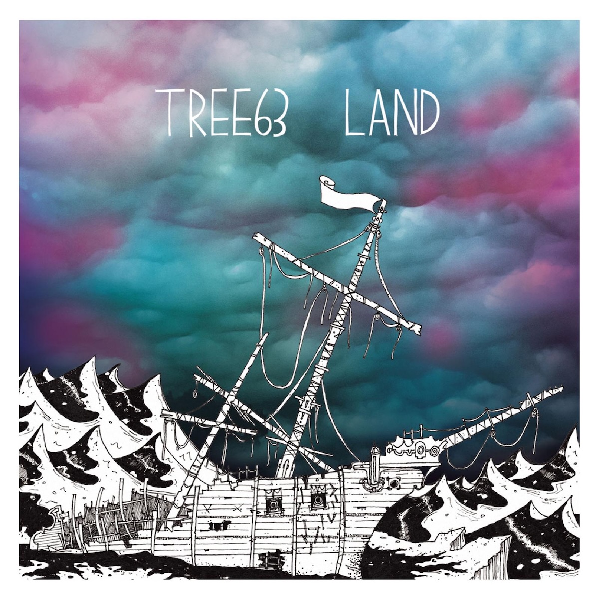
Released on this day 10 years ago is this sixth and final studio album from South African rock band Tree63. Eight years after their previous album, Sunday!, the band released this album after a successful crowd-funding campaign. It was really fun to hear from this legendary band again and hear them doing what they do best, which is quality rock with religious lyrics and not necessarily pop/worship anthems. 11 new songs are present and a few have a nautical theme like the cover artwork. It was fun to hear a new version of "Stumbling Stone" from their 1999 63 album from back when the band was just known as "Tree". It's not my favorite album of theirs, but it was so good to hear more from them and get to hear them do the music they wanted to do independently, not just what a record label thought they could sell. Thanks for making this for us fans, John Ellis and mates. Best wishes to the band members on their current careers, whatever they are, and thanks for all the great music.
Release Year: 2015
Listen on Apple Music
Listen on Spotify
Album Of The Day: Wind Up Bird by Matthew Thiessen & The Earthquakes
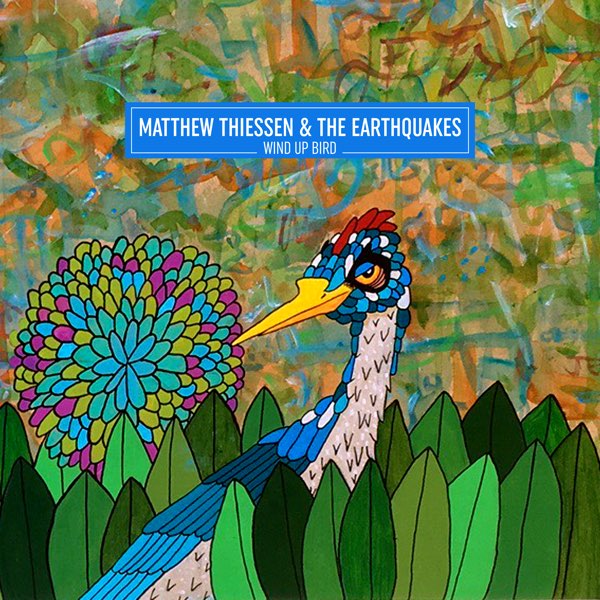
Matthew Thiessen is most well-known as the lead singer and primary songwriter of pop-punk band Relient K. But when he's not doing that, he sometimes records as "Matthew Thiessen & The Earthquakes". Released 7 years ago in late August, it's a fun acoustic-rock album. Lyrically, I'm not really sure what's he talking about much of the time, but there are references to Oedipus and Robin Hood, love and the meaning of life. Musically, it sounds very simple and organic, with mostly just acoustic guitar and a simple drum kit, sometimes piano, and sometimes it's upbeat or a little slower. Matthew Thiessen is a wildly talented songwriter and it's fun to hear him do a bit different style and sing about different topics from his more well-known band. Give it a listen if you haven't checked it out yet; you'll find it a bit quirky but delightful.
Release Year: 2018
Listen on Apple Music
Listen on Spotify
Album Of The Day: Lauren Daigle by Lauren Daigle

Released 2 years ago today, this is the fourth and latest album from pop singer/songwriter Lauren Daigle. She's got great vocals and I love her musical style: it's a mix of crooning like Adele, Gospel/R&B, and beautiful creole jazz from her home state of Louisiana. In 2018 she had a top-notch album with Look Up Child, and if this new self-titled album isn't as good or worth the five-year wait, it's definitely not a shortage of new songs. Daigle delivers 20 songs for a lengthy double album, and although it's never bad songs, it never really wows me like the last album did. She does speak very personally about her struggles in life on some songs and celebrates God's love and grace on others. There are a few songs that might make some of her Christian fans uncomfortable, but that might be a good thing to make them think a bit. I need to listen to this more because I did like it more than I remembered from my last listen.
Release Year: 2023
Listen on Apple Music
Listen on Spotify